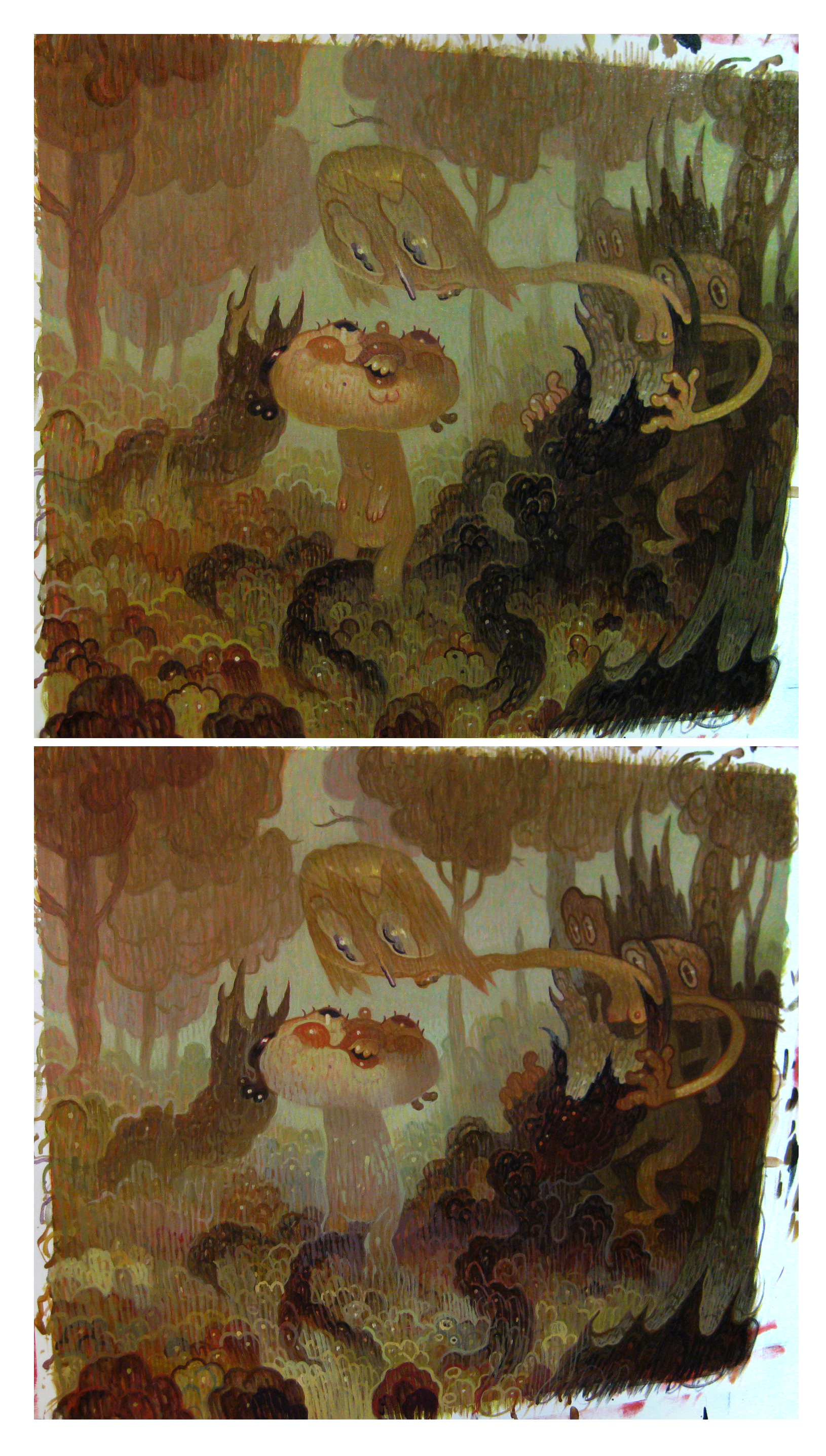
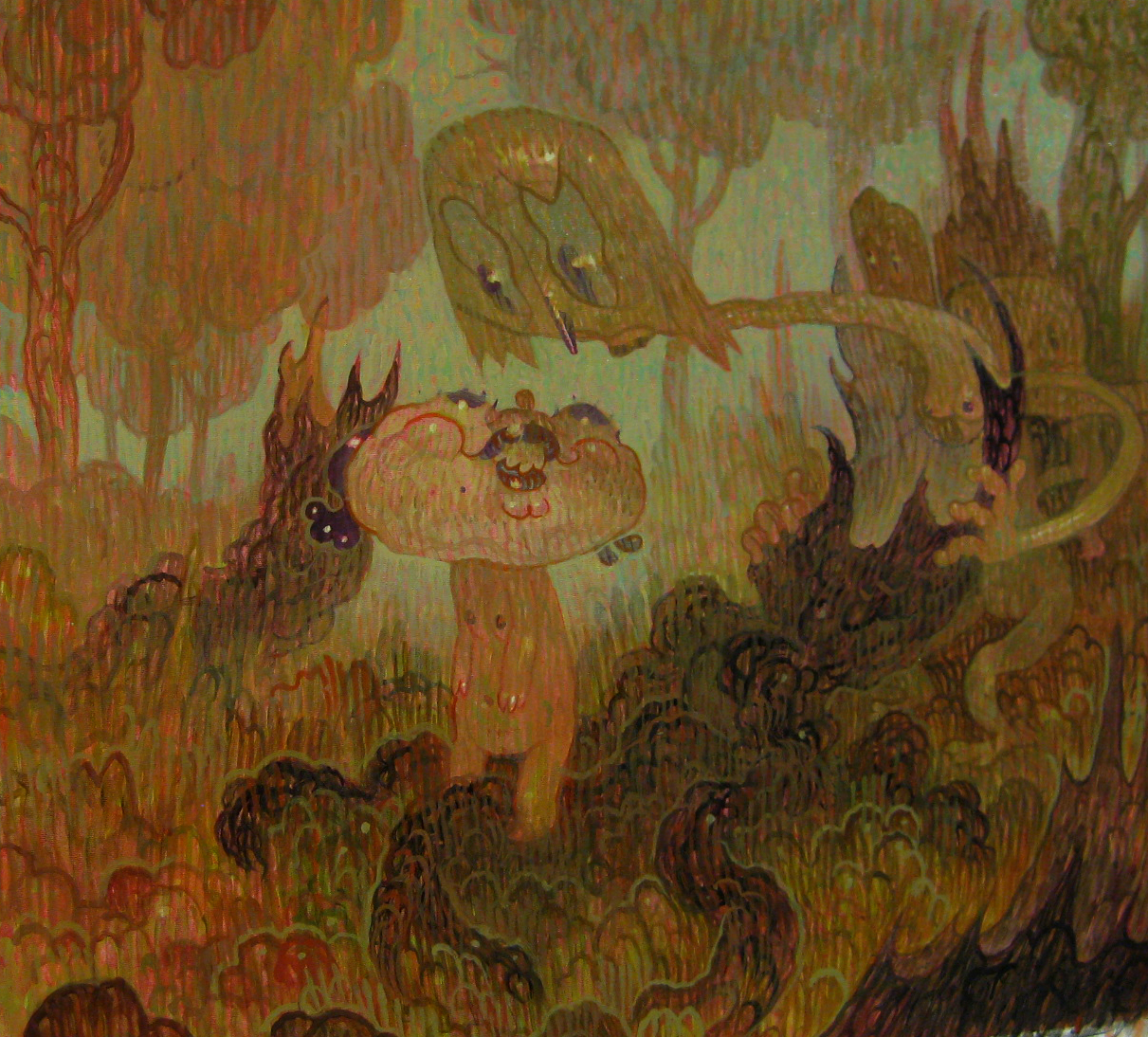
Peering Over/Looking Back, pt 8 (final).

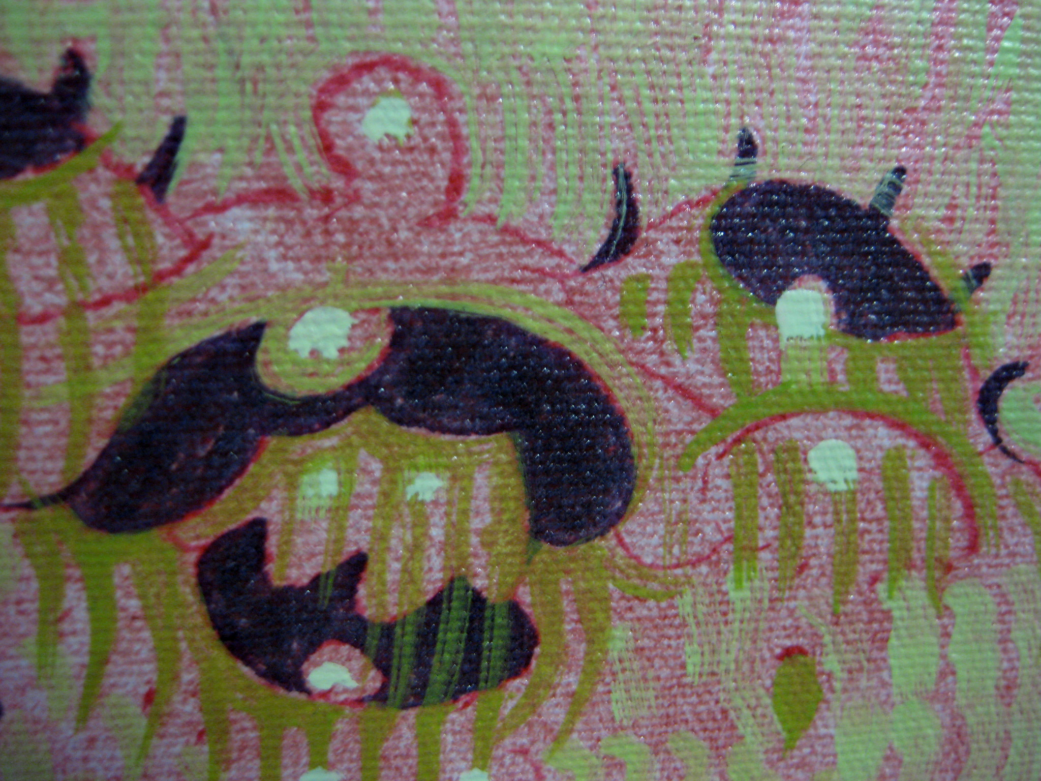
ah, that last day. just reaping the rewards of all those days and days of figuring and hair-pulling. validation that you DID know what you were doing after all. during the whole process i do my best to keep the well-defined things somewhat obscure, and to keep the diffuse, ill-defined things readable and palpable. it’s like making everything work in the middle where there are no absolute darks or lights. but then at the very end i allow myself those intensities where they’re absolutely necessary and where they’ll make things pop.

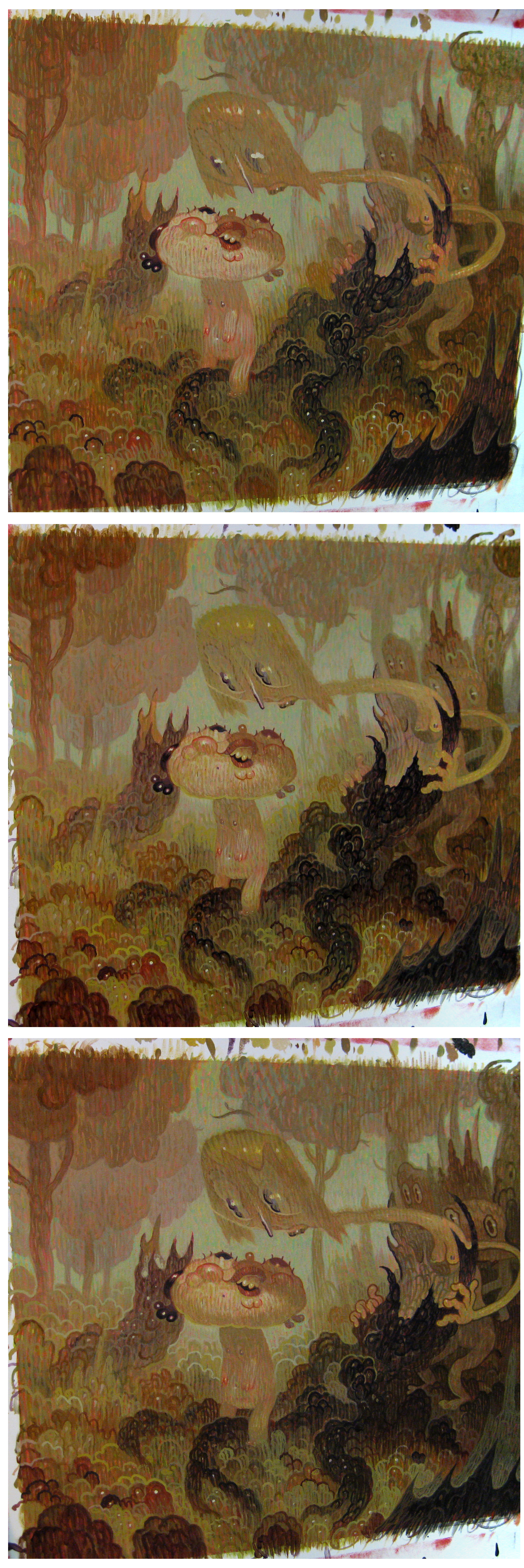
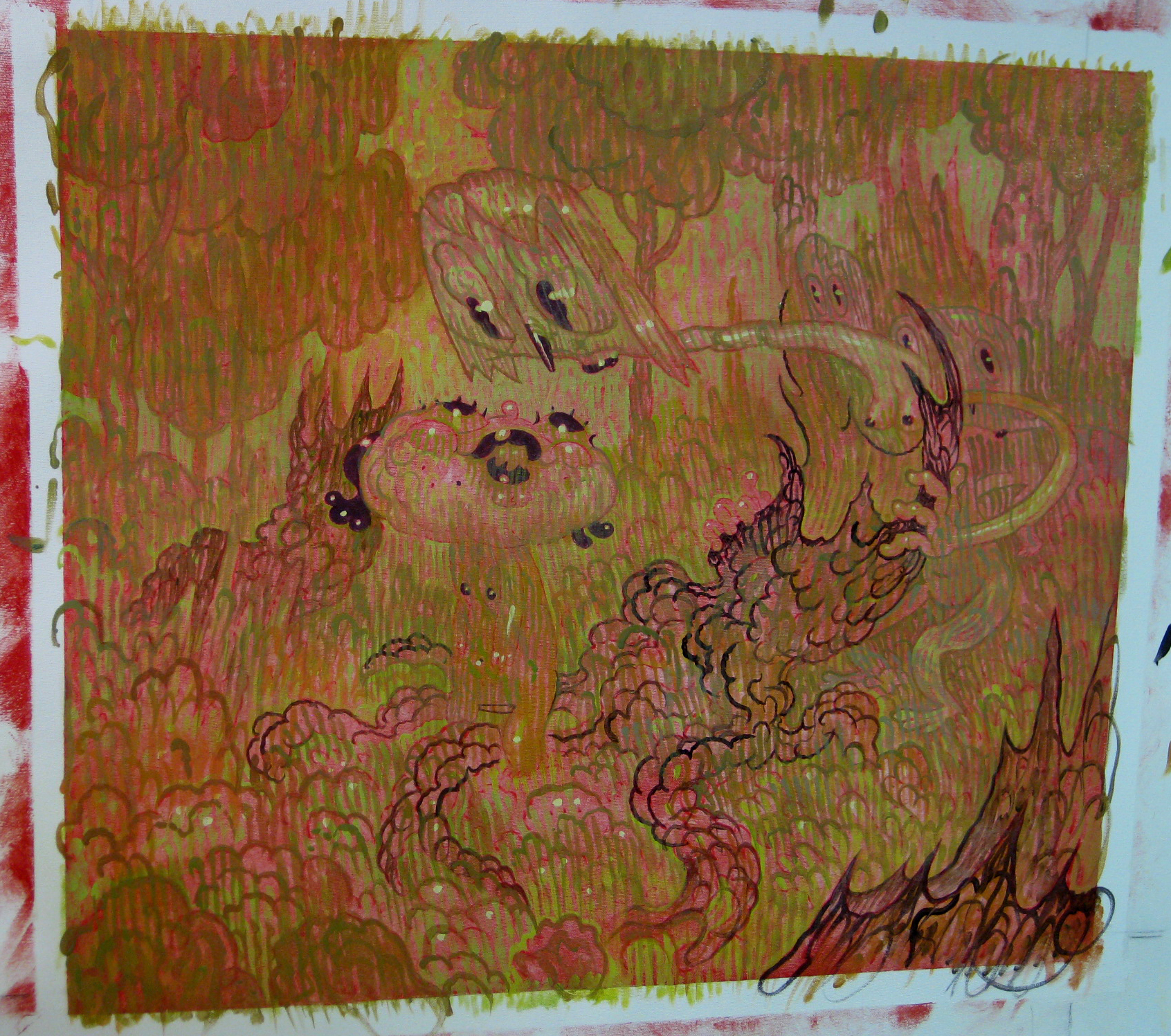
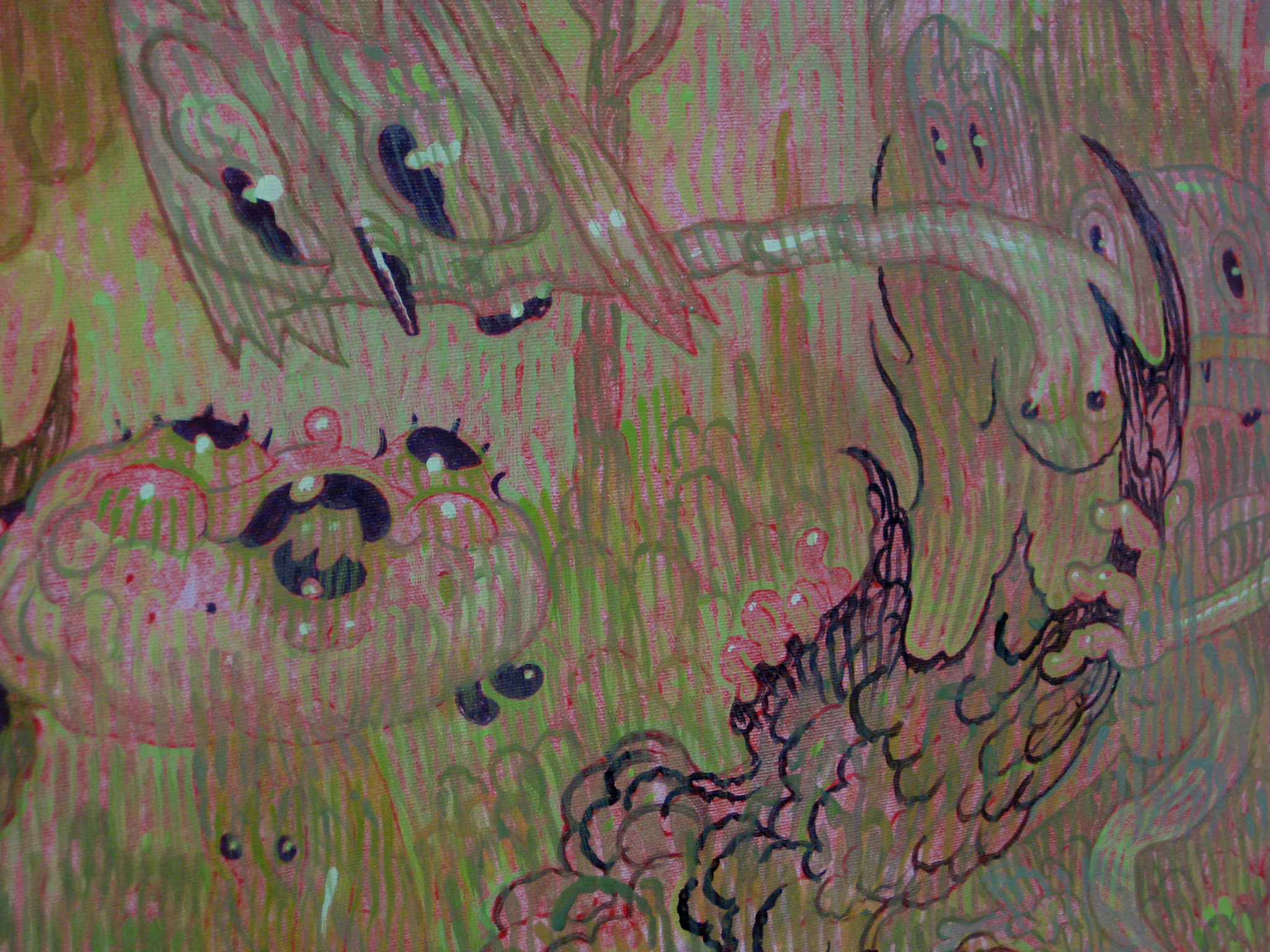
Peering Over/Looking Back, pt 7.

here are a couple of shots that were taken during several of the final days on “Peering”. things got a little too dense and saturated -as they often do- so i obscured/lightened quite a few things with some semi-opaque glazes and opaque marks. it’s always good to unsettle areas that are too precious and defined– i find it can restore a spirit of authenticity and spontaneity sometimes.
it’s frustrating as hell not knowing where you’re going in the middle phases, but it does lead to this great mistake-making, and repeated give/take that ultimately gives the piece character and a kind of patina.
and just as plopping down confident white highlights can give you a rush of accomplishment, drawing authoritative, bright, opaque lines on a muddy, sloppy area can feel like you’re creating order with the hand of god. like tidying a room with the wave of your hand. if only the whole process was like that.

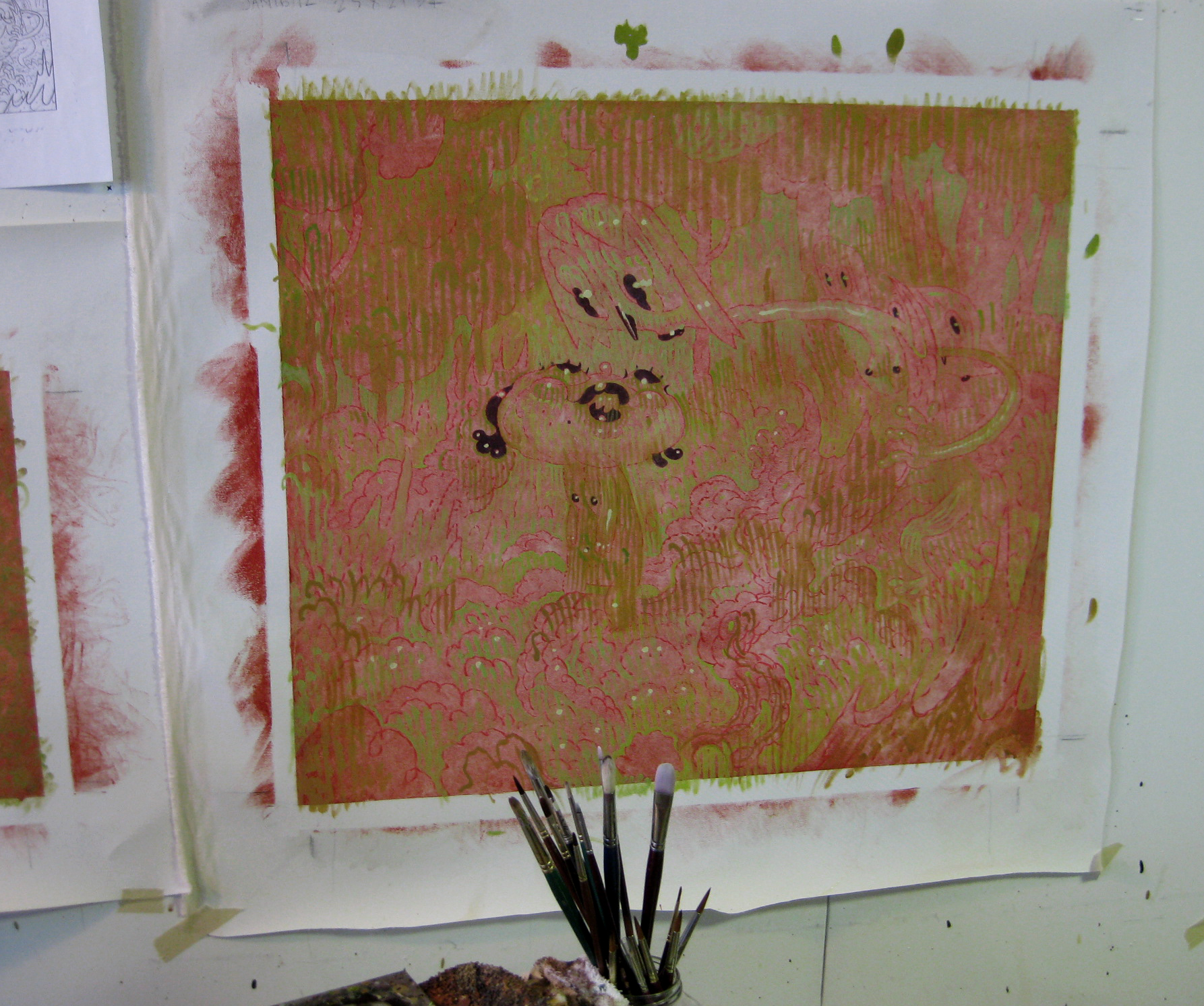
Peering Over/Looking Back, pt 6.

holy crap, even I can hardly tell the difference between these 3 separate days of work! no wonder i get so bummed out during the middle phases. it’s always the same: in the beginning there’s TONS of great progress, at the end it’s like you’re wrapping a kickass gift. but in the middle i’m just wandering around in the desert, clueless. i know from experience that it will work out in the end, but there’s still always that little part of me that thinks, “okay, it’s over. the well has officially run dry.”

click to enlarge

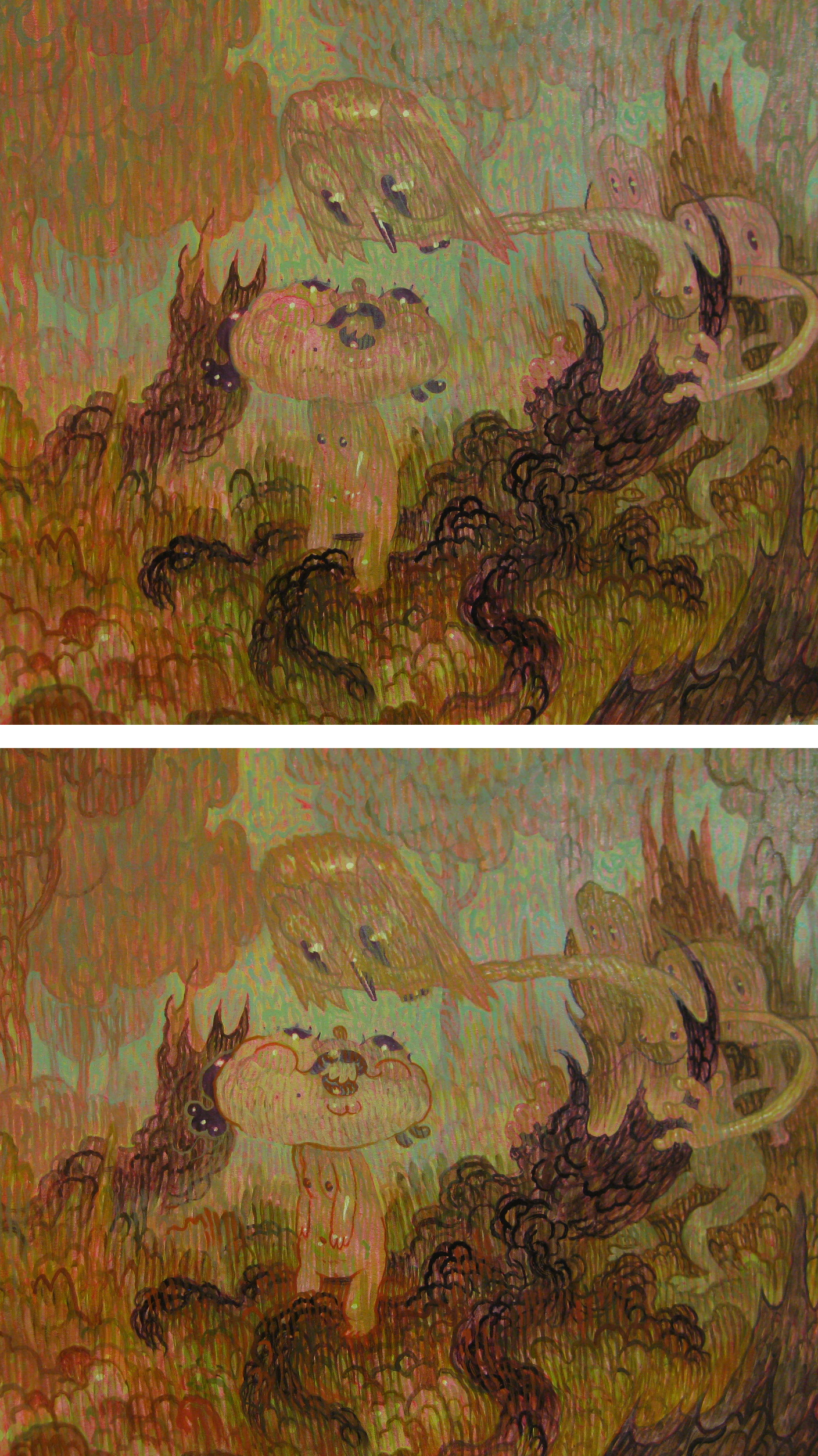
Peering Over/Looking Back, pt 5. colour and contrast…

here i keep adding some semi-opaque and translucent glazes to whatever areas seem to cry out for them. i push things back and pull some things forward by making them diffuse or sharp. again, these stages have no rhyme nor reason, and they can’t be easily quantified or rushed. i get really zen and just let the painting tell me what it needs. the moment you try to impose deadline or required outcome, you start digging a hole for yourself. if you let the painting dictate where it wants to go, you happily sidestep the hole and stroll along on the surface.


hey, check it out– it’s starting to look a bit like a painting! very slight differences here, but they represent a lots of time and thought…


here you can see how i begin to address the black dead trunk. i find it way more effective to define the dark edges by stroking the edge with something light, rather than trying to darken, darken, darken. it’s SO easy to darken later with a super traslucent glaze. so i try to avoid that battle till closer to the end. for now, i just want to get something interesting happening in that quagmire.
you can see that i’m gradually trying to define the subtleties of what’s happening between the two figures’ heads,  and the light/shade, and negative space involved. that’s really the core of the image, so it’s important that that work well.

Peering Over/Looking Back, pt 4. building up…

and now begins the long, tedious process of what i call establish, obscure, re-iterate, obscure, re-iterate, obscure, re-iterate, obscure, ad nauseum. the only way to get a drawing to look like a painting is to paint the shit out of it. no, i should say that’s the only way for ME to do it. i see lots of amazing painters accomplish it with economic approaches, but for me, it never looks like it’s coming alive unless there are layers and layers of give and take. so in the beginning i just start giving darks to the dark areas, and taking away from stuff what i want to be lighter (by painting over it semi-opaquely).

i’ll start to introduce a bit of colour at this point, but nothing literal. still sort of just pushing things a degree toward where they might end up. all the while i’m still trying to keep a messy colour mesh happening. so that nothing is ever “a colour” but rather a mess of hues. i’ll start to draw over the underdrawing with opaque colours so that things are not as clear and “drawingy”. still thinking of it all as a foundation for the real work to come.

next week, more of the same, ha ha! (not sure if i should start condensing entries during this long middle period. what do you think? long and detailed, or more concise? leave me a comment with your preference!)

Peering Over/Looking Back, pt 3. ground and some lights

now that the drawing has been transferred onto canvas, i just cover the whole thing with a slop of rusty red. you can use any colour you like for this, the trick is just to make sure it’s sufficiently transparent that you don’t totally obscure the drawing. i often use a colour that is the opposite of what most of the painting will end up being– so in this case, a red ground for a largely green painting. i learned that trick from my friend Leila who would paint an entire painting in exact opposites first, then re-paint the whole thing in the final colours. so for a red shirt, she’d paint it green first, then later paint it red. the result is a really great luminescence and sort of twinkly, alive feeling to the painting because you get a bit of the compliment of peaking though. it’s almost like an optical illusion that confuses the eye. it’s much like the opalescence you see on the inside of a oyster shell. i’m way too lazy to do it as meticulously as Leila, but i’m going for the same end result.
so with this first assault on the canvas, just broad applications of reds and greens. it looks awful and gutless, but it makes for a great foundation on which to build.

here you see the reds/greens (or warms/cools) starting to build a sloppy kind of colour mesh. i’m adding really moderate lights and darks with the greens and leaving the mids as is. maybe a couple very obvious white highlights- just to trick myself into feeling like i’m making more progress than i really am. they’ll all eventually get more or less painted over, and then replaced later.

next time i re-inforce a lot of what was shown here, gradually building up contrast and texture, and beginning to introduce some colour.

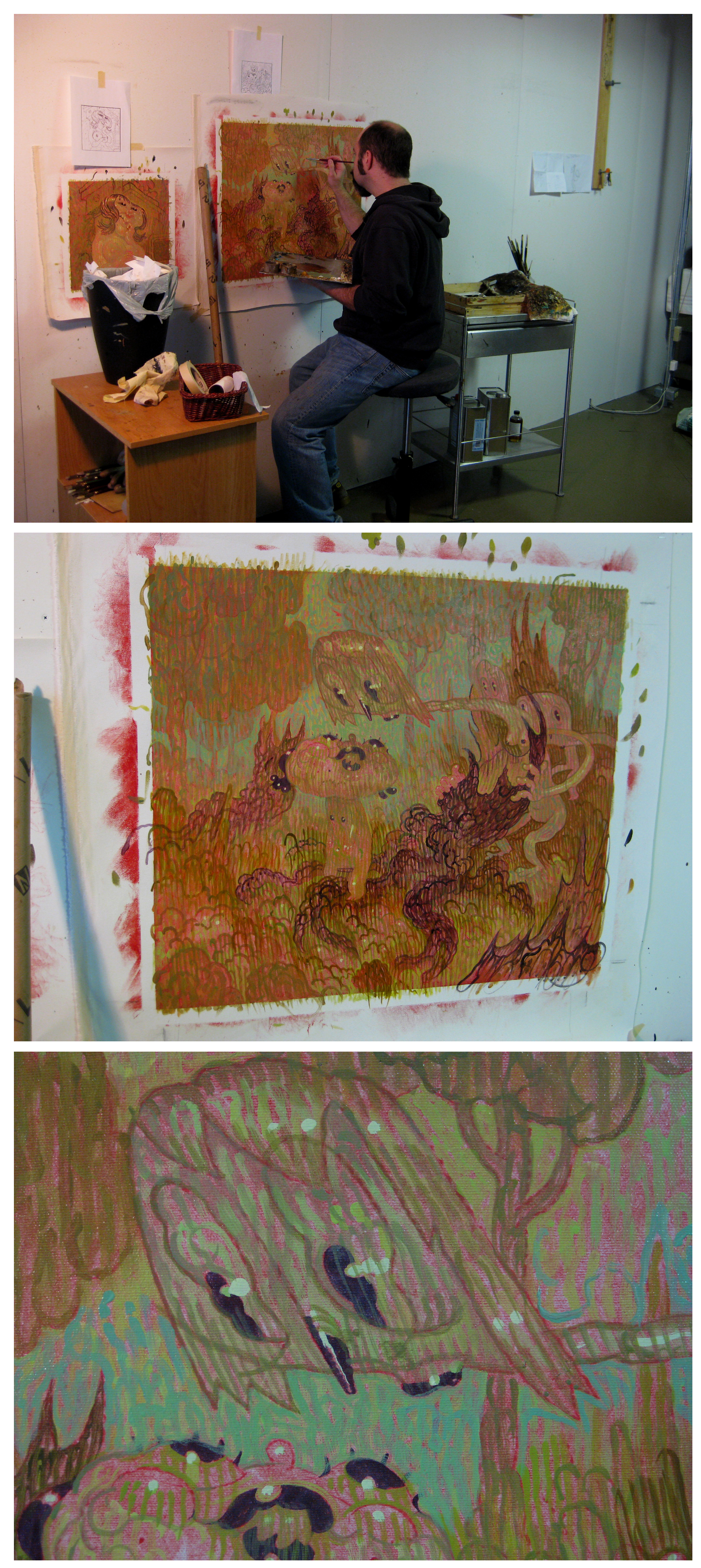
Peering Over/Looking Back, pt 2. projection transfer

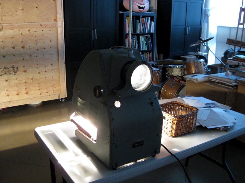
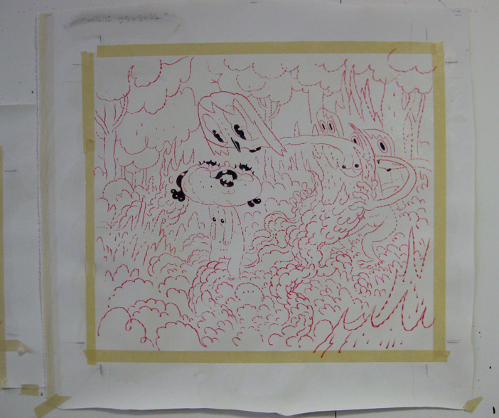
once the drawing is done i throw it into this beauty. you may recognize it from an old flickr set. i call it J.J. after my good friend J.J.Hommel who sent it to me from sunny California many years ago. he knew of a film industry storage room FULL of them. i got this one in trade for a little painting. it takes a one thousand watt bulb!

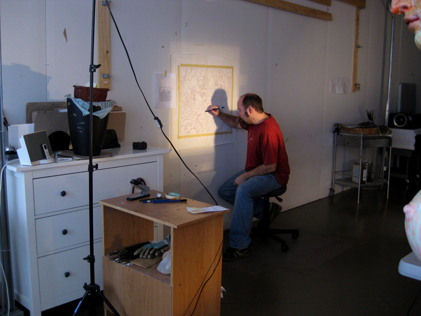
i staple the loose canvas to the wall and get the projection to the right size. in this case about 24 x 24″.

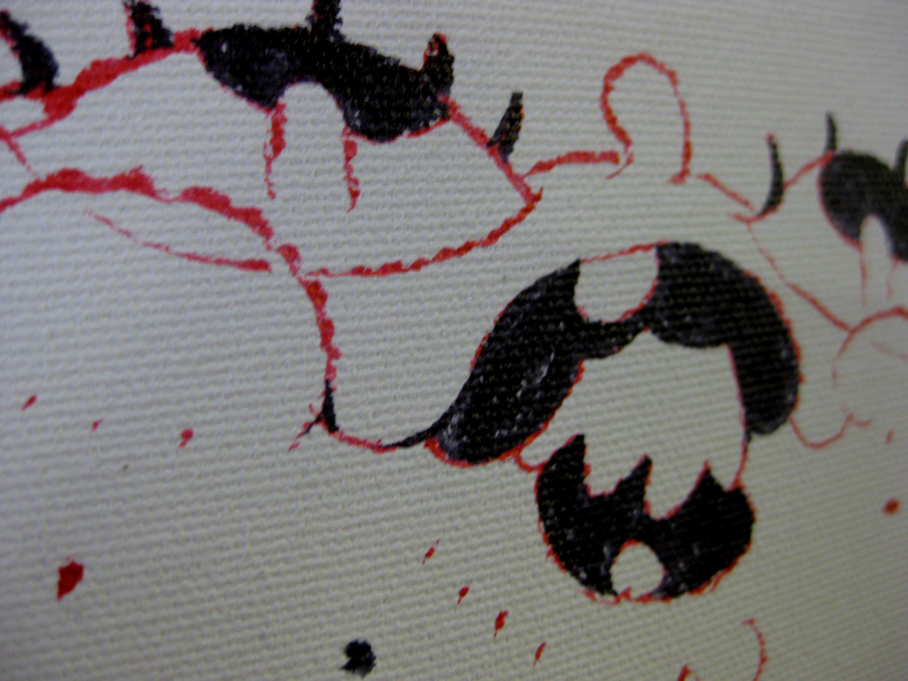
the projected lines are just barely visible. i have to do the the transfer when it’s dark out (usually early in the morning) otherwise the big windows flood the room with too much light. i use a red brush pen for the re-drawing.

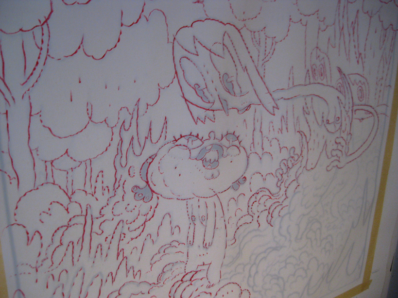
after the whole thing is transferred i’ll go in with a black paint brush pen to make a few bits pop.

and here’s how it looks all transferred and waiting to kick ass…

next time paint will fly.

cover illustration for Paris' "Liberation" newspaper (Angouleme edition)

last time i was in Paris for the big “Hey” show, the editor from Liberation came to say hi and invited me to do the coveted “Angouleme edition” of the newspaper.
here’s one of the first things i came up with that i really liked. usually when i take on a gig like this i try to think of a way to make something that will work for the client, but that will also be re-usable in one of my art books or graphic novels. in this case i thought the drawing might make a nice splash page in the Eddy Table compilation that i’ve had in mind for years.
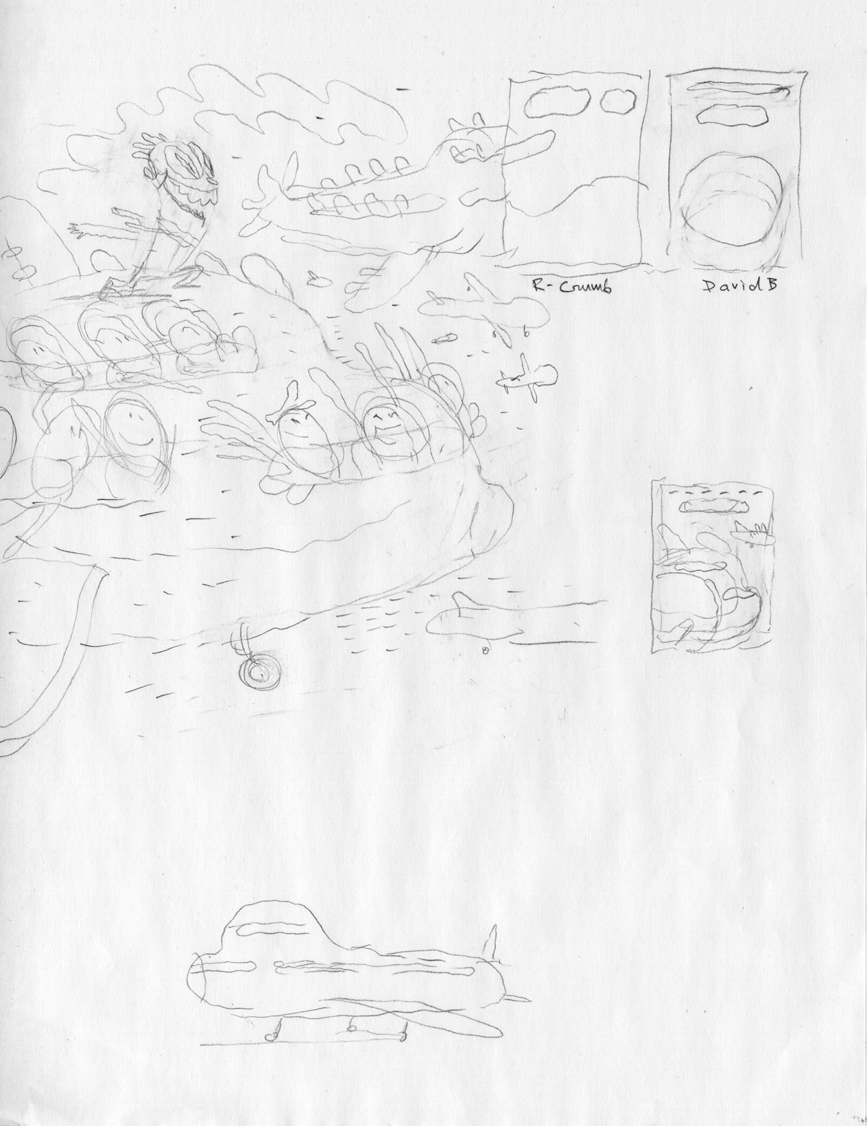
a quick concept doodle
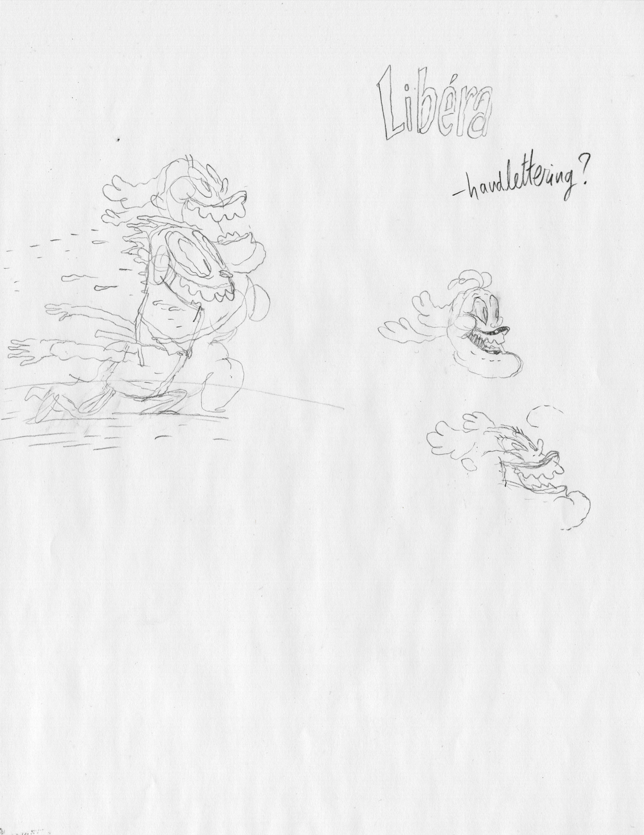

refining Eddy and his friend
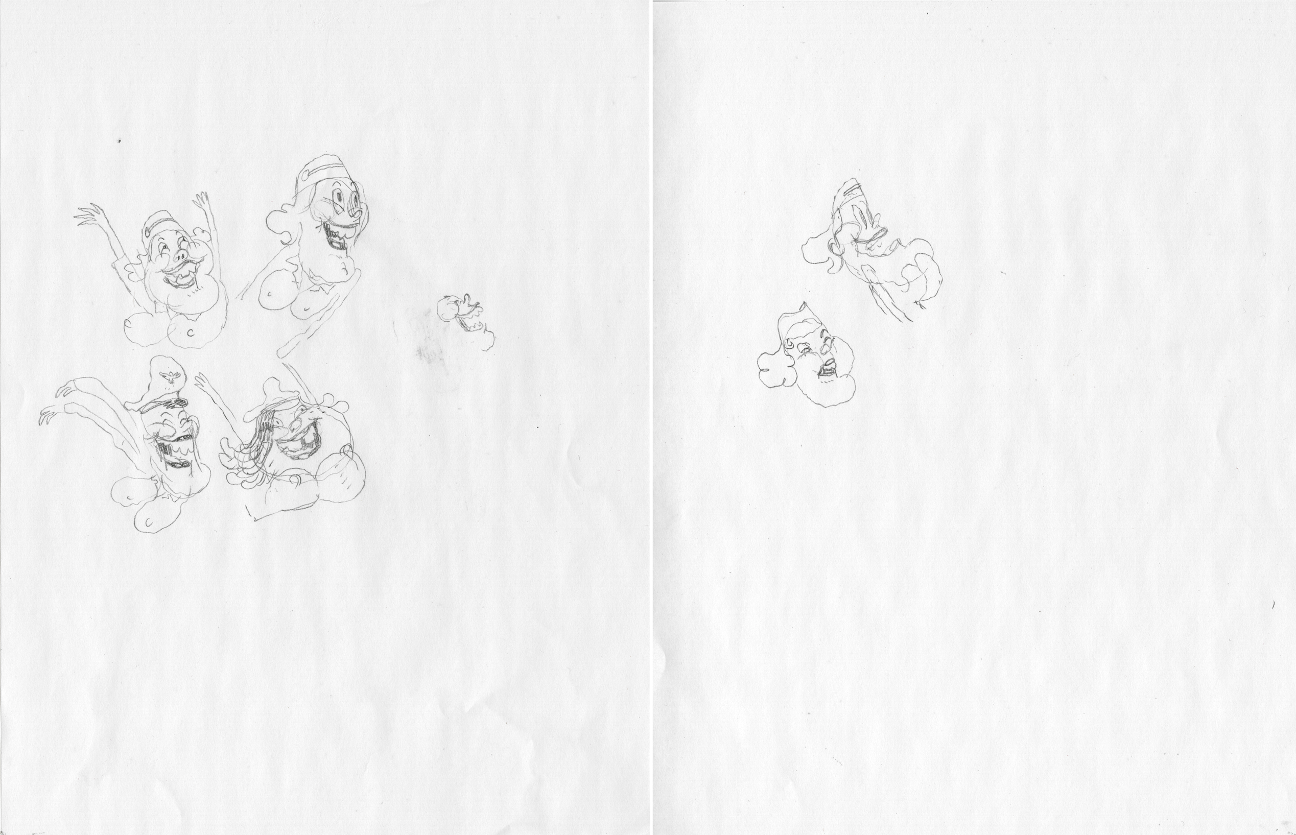

some gal doodles


once i have some nice doodles that feel right, i print the original rough out in light blue and re-draw over it, referring to the nice loose doodles. this is how i try to retain the loose, spontaneous feel leading up to inking.
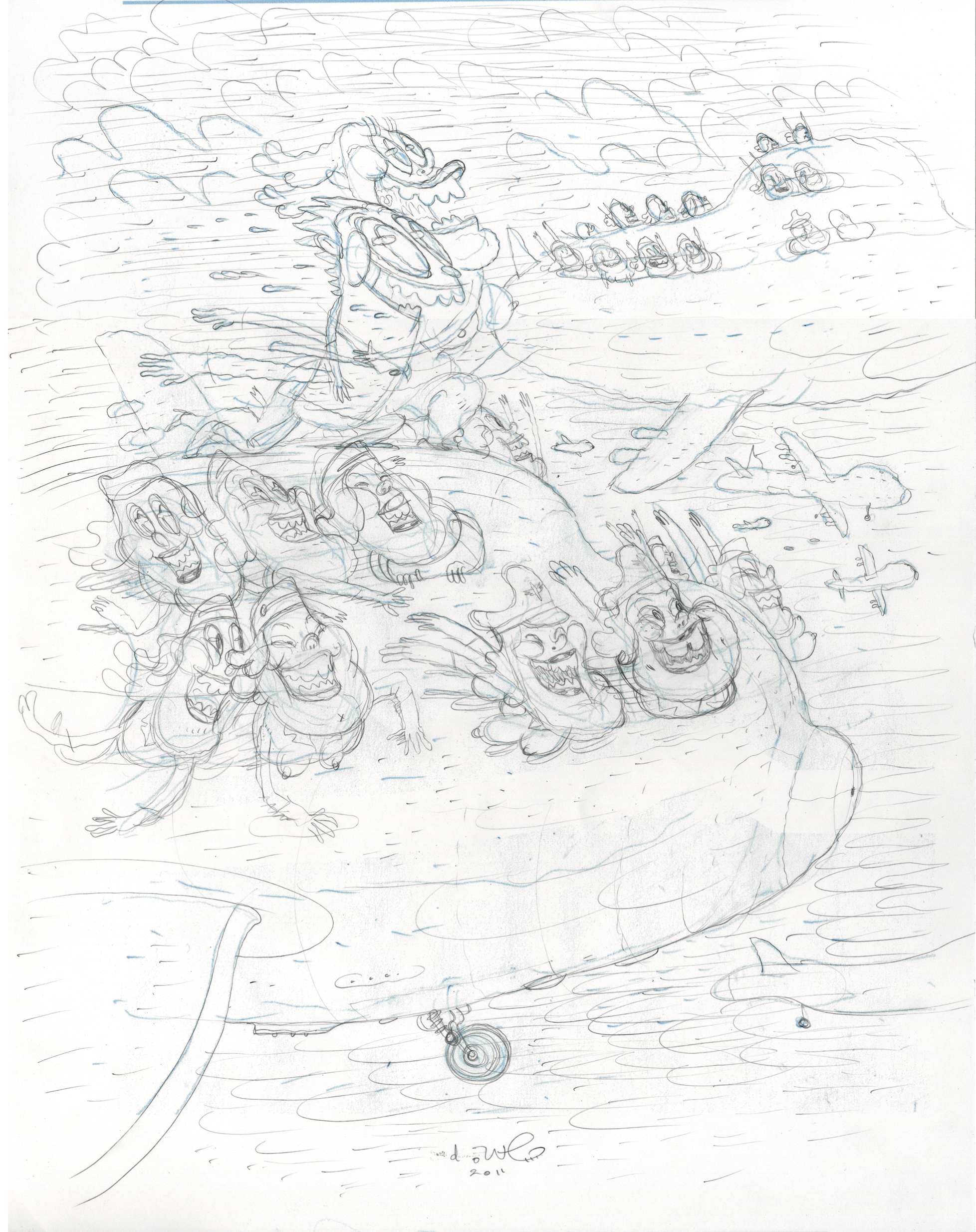
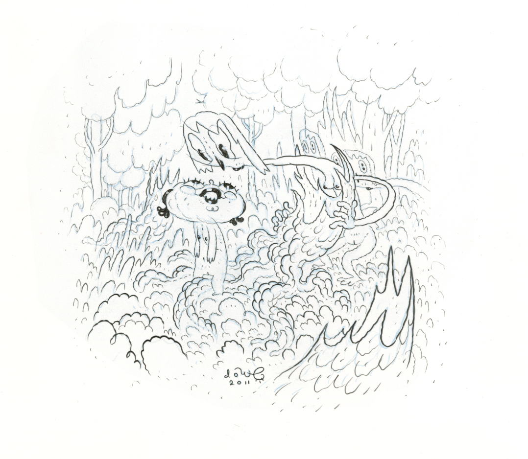
pencils


and here’s the most rewarding stage, where everything tightens up. hopefully in a loose way, if that makes any sense! i like things to look playful, but have a strong foundation. i’m going for an ink look, but in fact, i do all my final drawings with graphite on polypropylene (“Yupo” paper) these days.
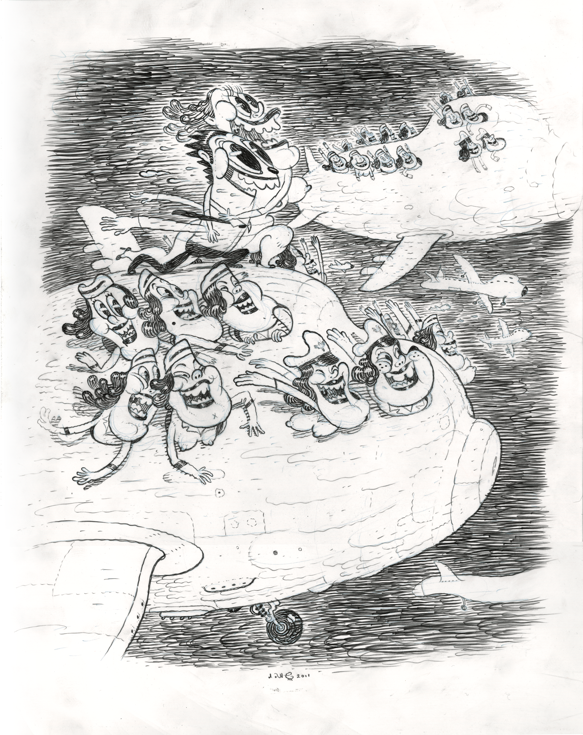
ink (actually graphite on polypropylene)


there was some last minute tweaking. the head honchos had me brighten stuff a little, remove some of the ladies to make room for text, but i’ll leave that version for just French newspaper readers. this is the version i like best.
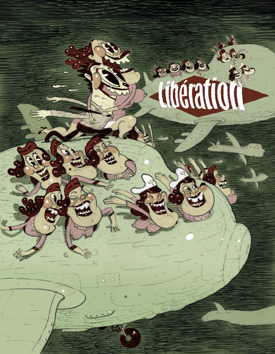
final illustration, coloured digitally
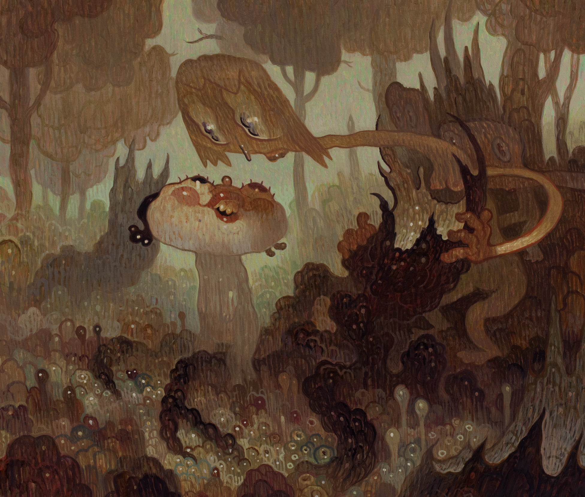

Peering Over/Looking Back, pt 1. doodle to final drawing

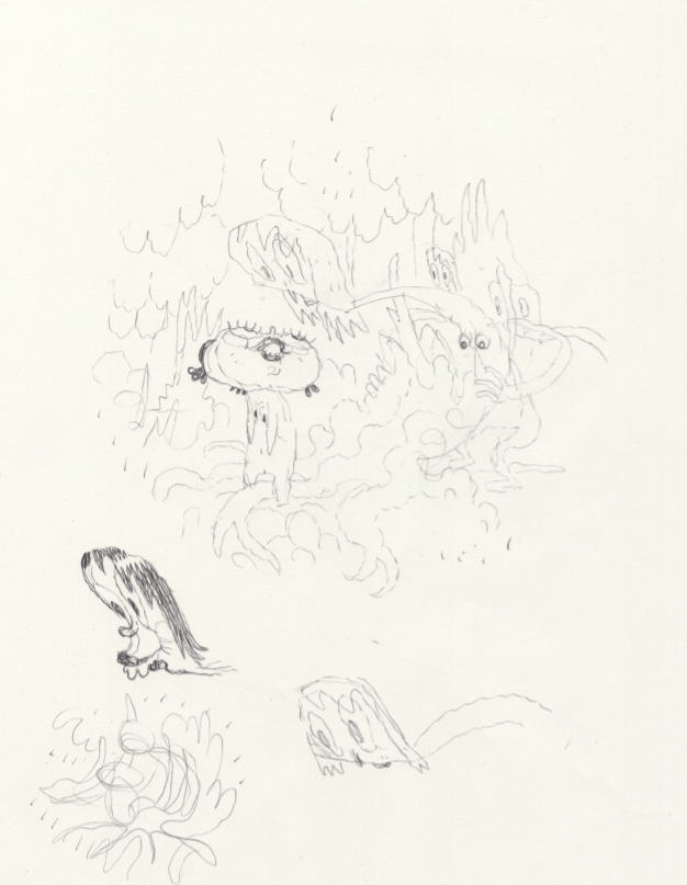
i recently got a commission to do a small painting for a Parisian dude. he didn’t have a specific idea, so as i often do, i just emailed him half a dozen JPGs of loose doodles. i’m always coming up with little thumbnails– there are always more than i can ever seem to get to. so when someone wants a commission, it’s great to be able to dig up one of these little gems that i’m already eager to make for “myself”.
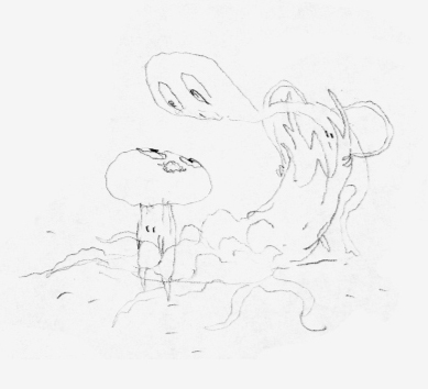
here’s the one he chose. the size was to be around 2 x 2′.


next i needed to flesh it out a little for final approval, and so that i could figure out the character details and what kind of environment they were in.


the buyer loved the sketch so i printed it out on really nice Yupo paper in super-light blue. that’s when i re-draw the sketch as definitively as possible. this is the drawing the i project onto canvas to re-draw to size– so at this point i don’t want there to be too much guess work. i still like it to be kind of loose so there’s room for interpretation, but within that looseness i need to feel like it’s “whole”– fully realized.


next time, i’ll transfter the drawing!